


I’ll be honest—my first deep dive into color theory happened somewhat accidentally. I was standing in front of a blank canvas, staring at a purple paint I had just mixed. It was rich, deep, and striking—but something felt off. I wasn’t sure if it needed balance or contrast, but one question kept nagging at me: What is the opposite of purple? I wanted to know if I could use that information to make my artwork stand out.
Fast forward a few hours and a few paint strokes later, and I finally figured it out. The opposite color on the color wheel to purple is yellow. This vibrant contrast helped my piece come to life, adding that perfect punch. It was a minor revelation that I’ve carried with me ever since.
Now, if you’ve ever wondered the same thing—whether it’s for your latest painting, design project, or interior styling—let me walk you through the concept. What is the opposite of purple? More than just a fun fact, understanding this color relationship can elevate your creative work in ways you might not expect.
Why Is Purple Such a Unique Color?
Before we answer the big question, it’s helpful to understand why purple stands out in the first place. Purple is often associated with royalty, spirituality, and creativity—its rich depth makes it a favorite among designers, artists, and decorators alike.
But here’s the thing: purple is a composite color. It’s made by mixing red and blue, which puts it on the edge of the cooler colors (blues and greens) and the warmer spectrum (reds and yellows). This duality gives it a unique position on the color wheel, making its opposite particularly interesting.
So, when we’re talking about the opposite of purple, we’re referring to the color that provides the most contrast, the one that can balance out purple’s intensity.
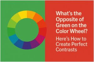
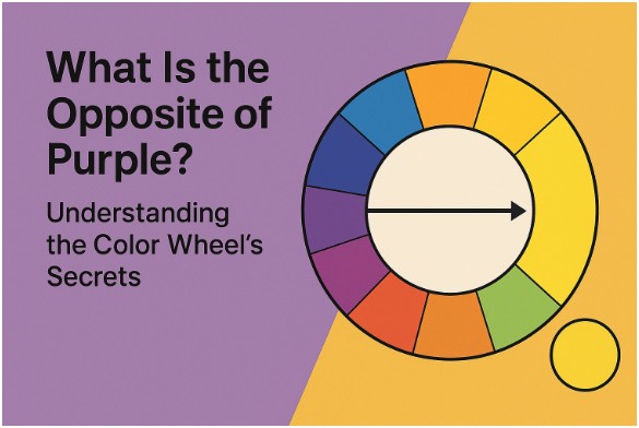
What Is the Opposite of Purple on the Color Wheel?
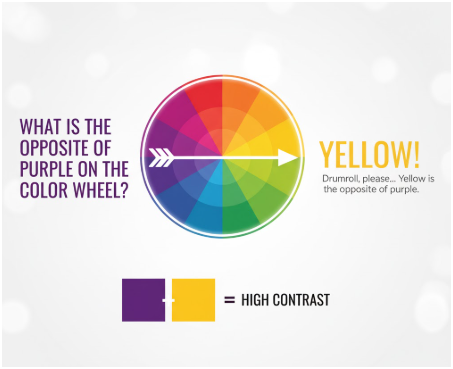
Drumroll, please… Yellow is the opposite of purple.
Let’s break it down: the color wheel is based on the principles of color theory, which divides the spectrum into primary, secondary, and tertiary colors. Purple falls into the category of secondary colors, formed by mixing red and blue. The opposite of purple is always found across from it on the wheel, which is yellow—the primary color made from red and green.
Yellow is the perfect complement to purple, creating a complementary color scheme. When paired together, these colors are vibrant and attention-grabbing. This pairing is often used to create high contrast and visual interest in art, design, and even branding.
Why Is Knowing the Opposite of Purple Important?
Understanding what the opposite of purple is can seriously elevate your design game. Here’s why it matters:
1. Creating Balance
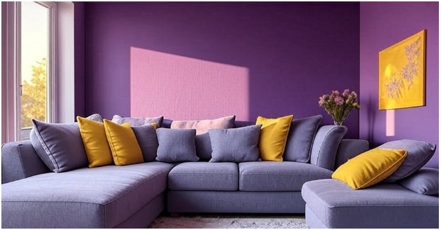
When working with purple (whether in fashion, design, or art), yellow can help balance out the intensity. Too much purple can be overwhelming, but the right touch of yellow can provide the perfect amount of contrast and freshness. Think of purple walls with yellow throw pillows—it pops without feeling chaotic.
2. Highlighting Key Elements
Yellow’s vibrancy makes it a great accent to purple. In interior design, for example, using yellow in small doses, such as in artwork or decor, can highlight a purple accent wall. This allows both colors to shine without either feeling dominant.
3. Evoking Strong Emotional Reactions
Purple and yellow are considered high contrast complementary colors, meaning they create a striking visual effect when used together.
They trigger strong emotional responses—purple often feels luxurious or mysterious, while yellow adds a sense of cheerfulness and energy. The two are working in tandem to create a dynamic visual experience that grabs attention.
How to Make the Most of the Opposite of Purple in Your Designs
Now that you know what the opposite of purple is, how do you make use of it in your creative work? Let’s explore how to harness the power of yellow when working with purple:
Step 1: Pair Purple and Yellow for Maximum Impact
Start by using yellow as an accent to highlight the elegance of purple. For example, a rich purple velvet chair in your living room paired with a yellow vase or artwork creates a striking focal point.
In art, a purple background with yellow details can make the central elements pop, grabbing attention without overwhelming the viewer.
Step 2: Experiment with Shades and Tints
While yellow and purple are complementary, you don’t always have to use pure hues. Experiment with different shades.
A mustard yellow pairs beautifully with a deep plum or lavender purple, creating a more muted but still bold look. Lighter yellows or even pastel yellows can soften the contrast for a more serene combination.
Step 3: Use in Small Doses
When using yellow with purple, try using yellow as an accent. A few key yellow items, such as throw pillows or artwork, will provide contrast without overwhelming the room. In painting, yellow can be used to highlight specific details or draw attention to focal points.
FAQ: What Is the Opposite of Purple?
What happens if I use purple and yellow together in design?
When paired together, purple and yellow create complementary contrast, meaning they make each other stand out more. This combination can be eye-catching and energetic, so use it carefully. In a space, it can create a vibrant, dynamic look—just make sure you balance both colors without overwhelming the design.
Can I use yellow with other purple shades, like lavender or violet?
Absolutely! The beauty of complementary colors is that they can work well with a wide range of shades. For example, a soft lavender paired with a buttery yellow creates a calming, feminine vibe, while a deep violet combined with a bold mustard yellow feels sophisticated and grounded. Mix and match to find what best suits your space or artwork.
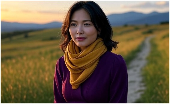
How does using yellow and purple in fashion work?
Purple and yellow are vibrant, high-contrast colors. For fashion, try a deep purple dress with a mustard yellow scarf or handbag.
The combination creates a bold, eye-catching look that’s perfect for making a statement. If you’re looking for a more subtle approach, opt for accessories in yellow rather than large clothing items.
Are there any other complementary colors, such as purple and yellow?
Yes! Each color on the wheel has an opposite. For example, blue and orange are complementary, as are green and red. These complementary pairs create visually striking contrasts and can be used similarly to purple and yellow to create balance and highlight essential design elements.
The Final Brushstroke: Embrace the Power of Purple and Yellow
So, what is the opposite of purple? It’s yellow—and this complementary relationship is more than just an interesting fact. Whether you’re painting a canvas, designing a living room, or curating a wardrobe, understanding the complementary colors to purple can help you create balanced, dynamic, and visually engaging designs.
When used thoughtfully, yellow and purple can elevate any creative project. So go ahead, experiment with that perfect pairing—use it to create a design that pops, a room that feels alive, or a painting that draws the eye. And remember, color theory isn’t just for professionals—it’s for anyone who wants to make their world more vibrant.