


I’ll admit it: when I first started studying color theory in-depth, I had one particular “aha” moment that completely changed my approach to painting. I was working on a landscape painting and using greens everywhere—trees, grass, shadows—and it all felt… too much. It wasn’t until I learned about the opposite of green on the color wheel that things fell into place. The answer? Red.
I’ve used this contrast ever since to create harmony and visual pop in my work, whether in paintings or designs. The opposite of green is red, and the way these two colors interact can elevate your projects from flat to dynamic in an instant.
If you’ve ever wondered about color wheel opposites and why they matter, let’s take a fun, detailed look at what the opposite of green on the color wheel is and how you can use this knowledge to your advantage.
Why Does the Opposite of Green Matter?
So, why do we even care about opposites in color theory? Well, complementary colors (colors directly opposite each other on the color wheel) have a special kind of magic. They’re not just contrasting; they’re balancing. When paired together, they create vibrant, visually stimulating compositions, whether in paintings, design, or interior decor.
The opposite of green on the color wheel, red, can provide energy and contrast to any composition that is predominantly green. This principle applies to everything from fine art to web design to the décor in your home.
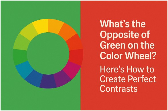
What Is the Opposite of Green on the Color Wheel?

When you examine the color wheel, you’ll notice that colors are arranged in a spectrum. The basic color structure is divided into primary colors (red, yellow, and blue), secondary colors (orange, green, and purple), and tertiary colors.
Green, made by mixing blue and yellow, sits directly across from red on the color wheel. This means red is the complementary color of green, making it the perfect color to use when you want to create high-contrast, vibrant visuals.
Whether you’re working with hues of green like forest, mint, or olive, the complement is always red, ranging from deep crimson to soft pinks. When used together, these two create a visual harmony that catches the eye.
How Can You Use Red and Green Together Effectively?
Now that we know the opposite of green on the color wheel is red, let’s talk about how to use this powerful pairing in your work. It’s one thing to know the theory behind color combinations, but it’s another to put it into practice in a way that’s not overwhelming.
1. Balance Boldness
When working with green and red, balance is key. You don’t need equal parts of each color. Let one color dominate while the other accentuates.
For example, a rich green landscape can feature pops of red (such as in flowers or autumn leaves) to draw attention without being overwhelming.
When designing a website, consider how you will utilize these colors in the background and accent pieces. Perhaps a muted green background with red accents in the logo or call-to-action buttons would be effective. This creates an engaging and energetic design that still feels balanced.
2. Think About Shades
If the brightness of pure red and green feels a little jarring for your tastes, you can tone it down by using different shades and tints.
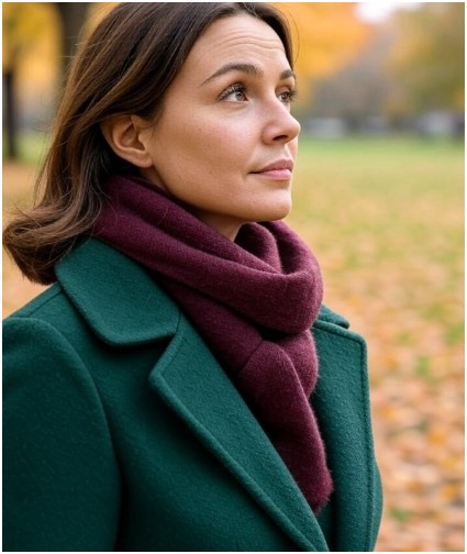
A deep, dark green can pair with a muted burgundy, or a soft pastel green can look fantastic with a dusty rose. These variations still maintain the complementary relationship but soften the intensity.
In fashion, think about pairing a deep green coat with a wine-colored scarf or shoes. The contrast is rich but approachable.
3. Use Red and Green in Nature-Inspired Designs
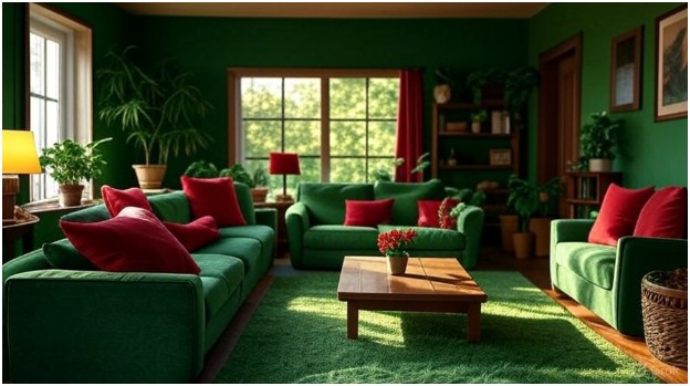
Green and red are everywhere in nature, especially during the fall season, where we see the stunning juxtaposition of green leaves turning to fiery reds, oranges, and yellows. This makes the pairing of these two colors feel inherently natural, so don’t be afraid to bring them into organic design or nature-inspired spaces.
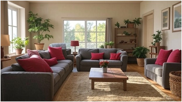
For instance, a nature-themed living room could feature a dark green rug with red-toned artwork on the walls, creating a peaceful yet vibrant ambiance.
How to Make the Most of the Opposite of Green in Your Designs?
Okay, now that you understand what the opposite of green on the color wheel is, let’s get practical. Here are a few tips on using red and green together in your creative work, whether you’re painting, designing, or decorating:
Step 1: Choose Your Green
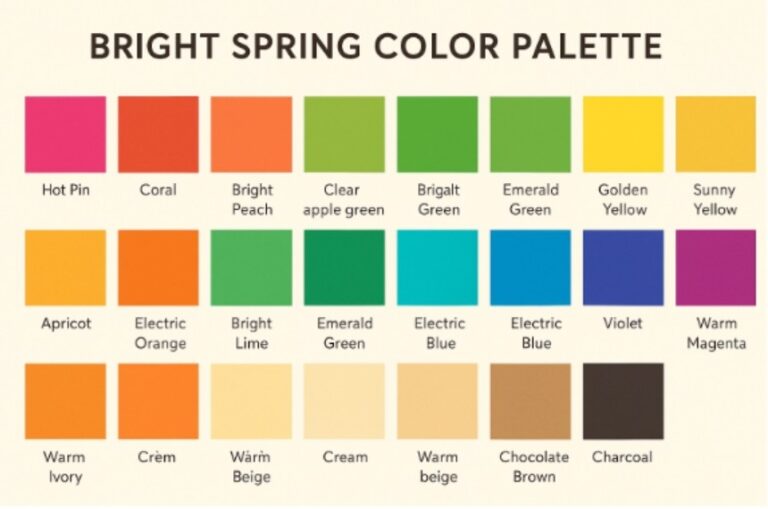
Do you want a bold, vivid green like emerald, or a softer, more neutral olive? Your choice of green will influence how red interacts with it. A bright green can work beautifully with deep, muted reds, while soft, muted greens pair better with lighter, pastel reds.
Step 2: Pick Your Red
Red is a powerful color, so choose your shade carefully. A rich crimson will create a strong contrast against dark greens, while a bright red may pair better with lighter greens, such as mint or sage.
Step 3: Experiment with Proportions
Start by using one color as the dominant tone. For example, use green as the primary color in your painting or room decor and introduce red as an accent through small elements like flowers, pillows, or accessories. The key is moderation—a little red can go a long way when paired with green.
Step 4: Add Neutral Balances
To keep the combination feeling grounded and not overwhelming, introduce neutral colors such as white, black, gray, or beige. These colors will help balance out the vibrancy of green and red, preventing the space or artwork from becoming too intense.
FAQ: What Is the Opposite of Green?
Is red the only opposite of green?
Yes, on the standard color wheel, red is the complementary color to green. However, depending on the shade of green you’re using, you might choose a corresponding red (from bright scarlet to deep burgundy) to create the most harmonious contrast. Different shades of green call for different red tones, but they are all complementary colors.
Can I use colors other than red?
Absolutely! While red is the complementary color to green, you can also experiment with other colors like orange, yellow, or brown, depending on the mood you want to create. For a more subdued look, try pairing green with neutrals like beige, gray, or white. However, for bold statements, red is still your best friend.
Is it challenging to create a cohesive look with red and green in fashion?
Not at all! When styling with red and green, it’s all about balance. For example, if you’re wearing a deep green jacket, pair it with a small red accessory, like a scarf or handbag, for that pop of contrast. You don’t need to overwhelm your outfit with both colors. Just a hint of red in a green-themed outfit can work wonders.
Can the opposite of green (red) be used in digital design?
Yes! In digital design, red and green are often used together to create vibrant, high-energy visuals. Just remember that in web design, accessibility is a crucial consideration. Strong red-green contrasts may be complex for people with color blindness to distinguish, so consider using subtler shades or offering variations for improved readability.
The Final Brushstroke: Why Red and Green Will Always Be a Classic Pair
So, what is the opposite of green on the color wheel? It’s red—and when used thoughtfully, these two colors can create dynamic, vibrant compositions that are as visually striking as they are balanced.
Whether you’re painting a landscape, designing a website, or decorating a room, remember that the opposite of green—red offers powerful contrast and balance. Embrace the color theory behind this pairing, and you’ll discover how they complement each other in ways you never expected.
So go ahead, get bold, and use red and green together. The possibilities are endless, and this classic combo is sure to bring your creations to life.