


I have a confession to make. When I first started experimenting with colors, I wasn’t sold on blue. I mean, I appreciated its beauty, certainly, but I always gravitated toward the more vibrant shades, such as red or yellow. Blue, to me, was a bit… predictable. But the more I worked with it, especially in design and painting, the more I realized—blue is not only timeless, it’s powerful.
Fast forward a few years, and blue is now one of my absolute go-to colors, especially when it comes to creating a color palette. Whether I’m painting a seascape or designing a modern logo, the blue color palette offers immense versatility, ranging from calm oceanic tones to bold navy statements.
If you’re here, trying to figure out how to make blue work in your designs, you’re in the right place. Let’s break it down and explore how to master the blues, from soft pastels to deep navy, and everything in between.
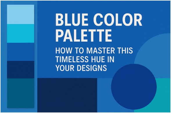
What Makes the Blue Color Palette So Versatile?
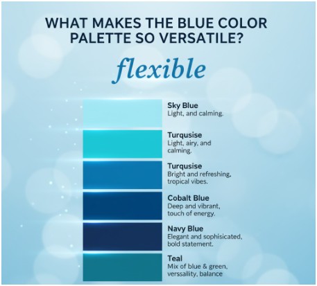
If I had to pick one word to describe the blue color palette, it would be: flexible. That’s the beauty of blue—it can be calming or bold, minimalist or dramatic, depending on how you use it. It’s not just for ocean-themed designs or corporate branding. Blue has a unique ability to create atmosphere and tone, whether in fashion, interiors, or fine art.
The blue color palette spans a wide range of shades:
- Sky Blue: Light, airy, and calming.
- Turquoise: Bright and refreshing, often associated with tropical vibes.
- Cobalt Blue: Deep and vibrant, with a touch of energy.
- Navy Blue: Elegant and sophisticated, perfect for making a bold statement.
- Teal: A beautiful mix of blue and green, offering versatility and balance.
The beauty of working with a blue color palette is that it can evoke a range of emotions, from tranquility to confidence, making it one of the most adaptable colors to use in your designs.
How Do I Use the Blue Color Palette in Design?
So, now that you’re excited about working with blue, let’s talk about how to use it effectively in your designs. From interiors to web design to painting, there are several ways to make sure your blue palette stands out while creating the mood or atmosphere you want.
How Can I Create a Calm and Serene Atmosphere with Blue?
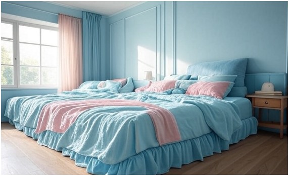
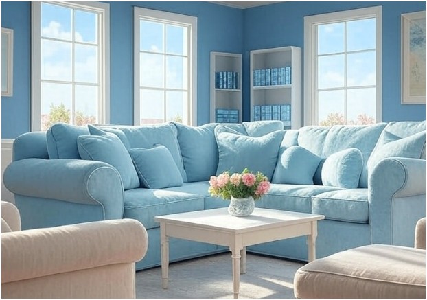
One of the most popular uses for blue is to create a sense of calmness. If you’re designing a bedroom or living space, consider working with a combination of soft blues, such as sky blue or pastel blue. Pair these with light neutrals, such as white or beige, to promote relaxation. You could also add subtle greenish-blue hues, like a soft mint, to enhance the serene feeling.
In painting, using a monochromatic blue palette can work wonders. Experiment with shades of blue, ranging from light to dark, to create depth and a peaceful mood, ideal for landscapes or abstract pieces.
How Can I Use Blue to Add Sophistication?
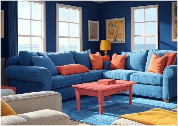
When you’re looking to make a statement, navy blue is your best friend. It’s the color of luxury and professionalism. Navy blue paired with metallic accents, such as gold or silver, can create a regal, polished feel in interiors or branding.
For a modern take, combine navy with white for sharp contrast, or use deep blue as the primary color in corporate logos to convey trustworthiness and confidence.
If you’re painting or designing a logo, consider adding small touches of gold or even a soft coral to add richness and contrast without compromising that refined elegance.
How to Make the Most of the Blue Color Palette
Ready to take the plunge and use that blue color palette? Here’s how to make it sing:
Step 1: Choose Your Base Blue Shade
Start with the color that works best for your project—do you want something soft and tranquil (think baby blue), or are you looking for something bold and rich (like cobalt or navy)? Select the base shade that suits the tone you want to establish, and let that guide your other choices.
Step 2: Mix and Match with Complementary Colors
Once you’ve chosen your base blue, it’s time to add in complementary colors. To keep things balanced, pair your blue with colors that contrast it, like:
- Soft neutrals, such as beige or gray, create a calm and contemporary look.
- Warm colors, such as yellow, coral, or orange, can add energy and vibrancy.
- Earthy tones, such as deep brown or forest green, for a grounded, organic feel.
For instance, navy blue can be paired with mustard yellow for a chic, modern look, or turquoise blue can complement soft coral beautifully for a fresh, tropical vibe.
Step 3: Play with Different Tints and Shades
Another key to mastering the blue color palette is working with its tints and shades. Tints are lighter versions of the base color (created by adding white), and shades are darker versions (created by adding black).
Experiment with these variations to add depth, contrast, and visual interest to your design. For example, a soft baby blue with a dark navy blue creates a beautiful, layered effect.
Step 4: Use Texture to Enhance the Palette
Texture can elevate any color, but it’s especially important with blue. A flat wall in pale blue feels soft, but adding some textural elements—such as a velvet throw pillow or a matte finish—makes that blue feel richer, more inviting, and dynamic.
The same applies to digital designs—adding depth to backgrounds or using gradients with your blue hues can make your designs appear more polished and sophisticated.
FAQ: The Blue Color Palette
What colors should I pair with navy blue?
Navy blue pairs wonderfully with both warm and cool tones. For a sophisticated look, try pairing it with gold or silver. For a softer, more serene palette, navy looks beautiful with light gray, white, or even soft pastels like blush or mint. It’s a color that works well with both neutrals and vibrant colors, so you can’t go wrong.
How can I create a blue color palette that works well in a small room?
In a small room, lighter blues, such as pastel or sky blue, can create a sense of space and openness. Pair these with neutral shades—such as white, beige, or soft grays—to keep the room feeling light and airy. Avoid using dark blue as the dominant color, as it can make the space feel smaller. Use it in accents or for one one-statement wall, combined with lighter shades for balance.
Can I use blue for a minimalist design?
Absolutely! Blue is a fantastic choice for minimalist designs, especially when you choose muted shades like soft gray-blue or powder blue. These calm hues complement clean lines and neutral tones perfectly. For a striking minimalist look, consider using deep blues, such as navy, paired with white or gray. It’s a bold yet simple combination that keeps the focus on the design itself.
Is blue suitable for a kid’s room?
Blue is perfect for a kid’s room! It’s calming, versatile, and can be adapted to fit both genders and any style. For younger children, light blues or pastel shades are soothing and complement playful themes well. For older kids, you can experiment with deeper blues, such as navy or cobalt, paired with fun accents like orange or yellow to add energy to the room.
The Final Brushstroke: Mastering the Power of the Blue Color Palette
So, what’s the real secret to mastering the blue color palette? It’s all about balancing boldness with calm, layering different tones and textures, and using contrasts to bring everything together. Blue is a versatile and timeless color that works in virtually any setting, from interior design to digital designs and fine art.
Whether you’re looking to create tranquility with soft blues or make a statement with navy, the blue color palette offers endless possibilities for creativity. Just remember to trust your instincts and don’t be afraid to play with variations of the shade—mixing tints and shades of blue can help you find the perfect balance for your project.
And always keep in mind: whether it’s a calming sea of pastel blue or a sophisticated navy accent wall, blue’s timeless elegance never goes out of style. Happy designing!