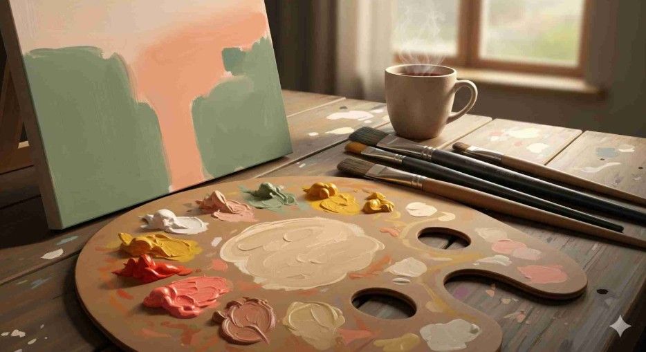
I’ll confess something: when I first started painting seasonal landscapes, I thought autumn had to scream. Burnt oranges! Deep browns! Heavy reds! But one day, I toned everything down and tried working with the light autumn color palette—soft apricots, muted golds, warm peaches, and gentle greens. Suddenly, the canvas didn’t shout; it glowed. That subtle shift gave my work a softness that felt more alive and approachable.
Since then, I’ve fallen in love with the lighter side of autumn. And if you’ve ever wanted your artwork to feel warm, radiant, and a little dreamy, this palette might be your new best friend.
What Is a Light Autumn Color Palette?
A light autumn color palette is built on warmth, but with a delicate touch. Instead of the dark, moody tones of late autumn, this palette captures the transition between summer and fall. Think golden leaves still kissed by sunlight, soft coral skies at dusk, and pale green fields that haven’t fully browned.
Colors in this range include peach, apricot, camel, warm beige, goldenrod, sage, and gentle olive. They’re all about balance—warmth without heaviness, richness without being overbearing. Used together, these shades create art that feels optimistic and full of life.
Why Does the Light Autumn Color Palette Feel So Inviting?
The magic lies in psychology. Lighter warm tones tend to evoke feelings of friendliness, approachability, and comfort. While darker autumn tones are introspective and cozy, light autumn shades invite you in with a smile. They make a space—or a canvas—feel brighter without losing that earthy grounding.
I like to think of it this way: dark autumn is the crackling fire at night, while light autumn is the afternoon sun streaming through amber leaves. Both are warm, but the moods are entirely different. For artists, using this lighter palette helps capture energy and motion without overwhelming the viewer.
How Can You Mix a Light Autumn Color Palette With Paint?
If you’ve ever mixed paints and ended up with mud, don’t worry—you’re not alone. The trick with a light autumn palette is keeping colors clean but warm. Start with bright hues like cadmium yellow or vermilion, then gently mute them with touches of white, ochre, or raw sienna.
For greens, try mixing sap green with a little yellow ochre to achieve that soft sage quality. For oranges and corals, combine cadmium red light with yellow and soften it with titanium white. The goal isn’t to dim the color completely—it’s to give it a sunlit softness.
This is one of my favorite demos to show students because their eyes widen when they see that a “quiet” palette can actually be the loudest in impact.
How Do You Use the Light Autumn Color Palette in Artwork?

This palette shines in subjects that need warmth without drama. Portraits benefit from it because golden beiges and peach tones flatter skin and create natural highlights. Landscapes look dreamy when built on soft yellows and sage greens. Even abstract works gain a kind of harmony that feels both modern and timeless.
My favorite trick is pairing a neutral background—say, warm beige or camel—with a pop of muted coral or goldenrod. It creates instant depth while keeping the whole composition approachable. The light autumn palette doesn’t scream for attention; it softly persuades.
How To Build Your Own Light Autumn Palette
Creating a working palette isn’t complicated, but it does take intention. Here’s my approach:
Choose your base colors – Golden yellow, peach, and warm beige are great anchors.
Add your secondary shades – Sage green, soft olive, and pale coral help with balance.
Include highlights – Cream and light apricot brighten without clashing.
Test in layers – Use glazes or thin washes to see how the warmth builds without getting muddy.

The palette works best when layered gradually. Think of it like watercoloring with oils or acrylics—translucent layers give that glowing effect autumn is known for.
Why Do Designers and Stylists Love the Light Autumn Palette Too?
Artists aren’t the only ones who rave about this palette. Interior designers love it for creating cheerful yet grounded spaces. Imagine golden-beige walls paired with sage-green furniture—it’s earthy without being heavy. Fashion stylists lean on these tones too, especially in fall wardrobes with warm camel coats, coral scarves, or golden-brown boots.
What’s exciting for artists is how transferable this palette is. If it flatters people in clothing and comforts people in homes, it will likely resonate in artwork, too. It’s proof that color theory moves seamlessly between industries.
Frequently Asked Questions
1. What colors make up the light autumn color palette?
This palette includes soft, warm tones like peach, apricot, goldenrod, sage, warm beige, camel, and muted coral. Together, they create a glowing, sunlit effect that feels both warm and gentle.
2. Can I use the light autumn palette in digital art?
Definitely. Digital platforms actually make it easier to experiment with subtle warmth. Use hex codes close to #E8C39E (peach) or #B2B28C (sage green) and adjust opacity for layering. This way, you can capture the transparency and softness that defines the palette.
3. Is the light autumn palette too soft for bold artwork?
Not at all. Soft doesn’t mean weak. In fact, when applied with contrast—like coral against a beige background—it can feel incredibly bold without being harsh. It’s all about how you balance accent colors with neutrals.
4. How do I stop light autumn colors from looking washed out?
Layering is key. Instead of slapping on a single flat tone, build colors gradually. Even digital artists can use multiple layers of the same hue at different opacities to keep the look glowing rather than faded.
Wrapping It Up With a Golden Brushstroke
So, is the light autumn color palette worth exploring? Absolutely. It’s one of those palettes that sneaks up on you—it feels simple, but the more you use it, the more you realize its power.
I always tell my students this: light autumn isn’t about restraint, it’s about radiance. You’re not muting your canvas, you’re giving it warmth and air. Next time you feel stuck, try painting with only peaches, golds, and sage greens. You’ll be surprised at how much personality those quiet colors bring.
Color doesn’t have to scream to be unforgettable. Sometimes, it just has to glow.


