


When I was in art school, I remember being obsessed with bright, neon hues. If it didn’t glow like a highlighter, I wasn’t interested. But one fall, I tried painting a landscape using the dark autumn color palette—think deep burnt oranges, olive greens, chocolate browns, and muted golds. The result shocked me.
My work finally had depth, mood, and warmth. That was the moment I realized sometimes the richest stories in art are told through restraint and shadows, not through neon explosions.
So why does this palette feel so timeless, and how can you use it to make your work come alive? Let’s break it down.
What Exactly Is a Dark Autumn Color Palette?
A dark autumn color palette is built on warm, earthy, and slightly muted tones that mimic the richness of the season. Imagine walking through a forest in late October: crunchy amber leaves underfoot, a deep green jacket, a burgundy scarf, and that golden glow as the sun dips earlier than you expect.
The palette isn’t flashy. Instead, it whispers sophistication and mood. Colors like deep rust, mustard yellow, teal, auburn, olive, and espresso brown dominate the spectrum. Together, they create a sense of coziness, nostalgia, and depth that instantly grounds any artwork or design project.
Why Does the Dark Autumn Color Palette Work So Well in Art?
The secret lies in balance. Bright colors demand attention, but dark autumn tones hold it. They’re less likely to overwhelm and more likely to create a mood. Artists use them to establish harmony between background and foreground, or to highlight contrast without clashing.
Another reason is psychological. Warm earth tones often make us feel comforted and safe, like wrapping up in your favorite blanket. In art, that emotional pull matters. A portrait framed in russet and olive feels instantly more intimate than one drowned in fluorescent pinks.
As someone who teaches color theory, I can tell you—these tones don’t just look good, they feel good.
How Can You Mix a Dark Autumn Color Palette With Paint?
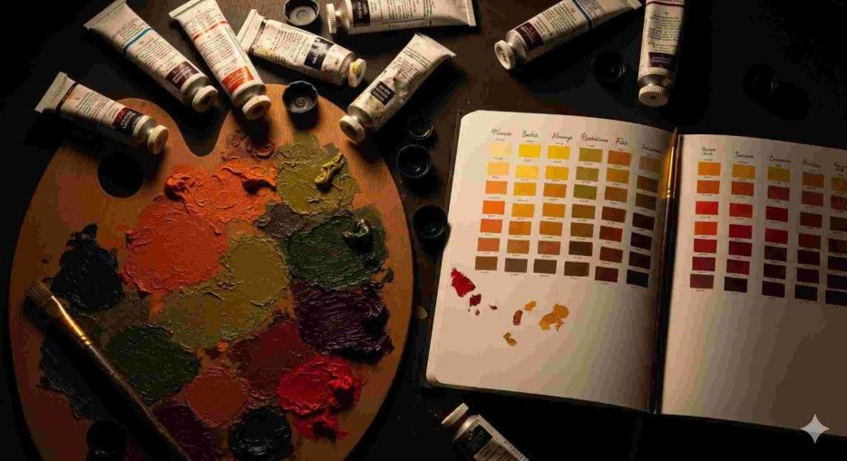
Mixing autumn shades is both art and science. You don’t need fancy pigments—just learn how to mute colors without killing them. For example, start with a bold cadmium red and tone it down with a touch of burnt umber. Or take ultramarine blue and muddy it slightly with raw sienna for a rich teal.
The key is avoiding pure primaries. You’re chasing subtlety, not vibrancy. Always ask: What would this color look like in shadow? That mindset helps you hit the sweet spot of autumnal depth.
When I demo this in workshops, students are often surprised by how much life a muted palette holds. Once they see how shadows and warmth interact, they rarely go back to candy-store brights.
How Do You Use the Dark Autumn Color Palette in Your Artwork?
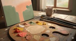
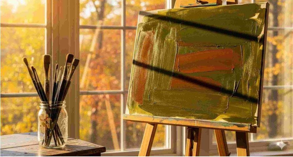
This is where the fun starts. The dark autumn color palette is ridiculously versatile. In landscapes, it’s an obvious choice—forests, harvest fields, or dusky sunsets thrive in these tones. But it shines equally well in portraits, abstracts, and even still life.
Try pairing a deep olive background with a mustard-colored focal point. Or use burgundy shadows in a portrait to make the skin glow against the darker undertones. These colors don’t shout, they smolder—and that’s often more powerful.
My advice? Use autumn tones as the foundation and sprinkle in one slightly brighter accent (like a golden ochre or muted coral). That way, your composition has both depth and energy.
How-To: Build Your Own Dark Autumn Palette
Here’s a step-by-step process to create a workable palette for painting or digital art:
Choose base tones – Pick 3–4 earthy shades like burnt sienna, olive green, and deep mustard.
Add shadow hues – Work in espresso brown, deep plum, or midnight teal to give weight.
Include accents – Use muted gold or copper sparingly for highlights that catch the eye.
Test balance – Paint swatches side by side. Make sure no color screams louder than the rest.
The trick is layering. Use glazes, washes, or digital opacity tools to build richness. Don’t be afraid of “mud”—controlled mixing is what makes autumn colors sing.
Why Do Designers and Stylists Love the Dark Autumn Color Palette Too?
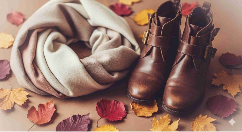
This palette isn’t just for painters. Interior designers love it for creating cozy living rooms, and fashion stylists swear by it for fall wardrobes. Think leather boots, wool coats, and earthy makeup shades.
The reason is universal: these colors feel grounded. They’re flattering on a wide range of skin tones, and they create inviting spaces without looking dull. If you’re decorating, a forest-green accent wall or rust-colored throw instantly warms up a space.
As an artist, you can take cues from these industries—because if a palette works in a living room, it will likely resonate on a canvas, too.
Frequently Asked Questions
1. What colors are included in the dark autumn color palette?
You’ll usually find deep earthy tones like olive green, mustard yellow, burgundy, rust, teal, and chocolate brown. These shades mimic fall foliage, fading sunlight, and natural shadows, creating warmth and depth in art or design.
2. Can I use the dark autumn palette in digital art?
Absolutely. In fact, digital tools make it even easier to create subtle variations. Adjust saturation and brightness sliders to get that muted look. Try layering textures or using gradient maps to replicate the richness of traditional paints.
3. Is the dark autumn palette too dull for abstract art?
Not at all. In abstract work, the moodiness of these colors can add drama and sophistication. You can always introduce a muted accent (like gold or coral) for contrast. Think of it as the difference between a whisper and a shout—whispers can be just as powerful.
4. How do I stop my autumn palette from looking muddy?
Layer carefully. Mud happens when you overmix too many pigments. Instead, build colors in transparent layers, letting the undertones shine through. This creates depth rather than flatness. Think glazing instead of stirring soup.
Wrapping It Up With a Pumpkin Spice Twist
So, is the dark autumn color palette worth adding to your creative toolbox? A thousand times yes. It’s soulful, versatile, and timeless. I’ve seen students transform their entire approach to painting after swapping neon pinks for russet and olive.
Here’s my tip: next time you sit down to create, limit yourself to autumn tones. You’ll discover that boundaries actually fuel creativity. And who knows—you might just fall in love with the quiet power of cozy, moody colors the way I did.
Warm hues, happy brushes, and a little seasonal magic—that’s the autumn artist’s recipe.