


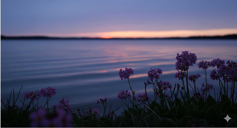
I have a confession: when I first studied seasonal color palettes, I dismissed the cool summer color palette as too restrictive. No bold reds? No warm oranges? Where’s the fun in that? But then, one rainy afternoon in Kent, I stumbled into a garden where soft pink roses leaned over a still pond under a lavender sky. Suddenly, it all clicked. This wasn’t about limitation—it was about subtle magic. The cool summer tones whispered serenity in a way no fiery palette ever could.
That’s the beauty of Cool Summer: it’s not about shouting your presence, but creating harmony, calm, and elegance. Let’s unpack why these hues work, what to avoid, and how to make the palette uniquely yours.
What Defines the Cool Summer Color Palette?
The cool summer color palette is one of the most focused in seasonal analysis. Unlike other seasons, it refuses to mix warm undertones. Every shade is strictly cool, giving the palette its serene and sophisticated edge. That makes it the most extreme—and in many ways, the most refined—of all the seasonal palettes.
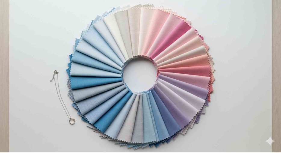
Picture soft gardens, lakeside reflections, and pastel skies. The hues are drawn from nature at its calmest: a wide spectrum of blues (except the violet-leaning ones that belong to Winter), fresh blue-pinks, muted purples, and an enchanting surprise for many—blue-greens and green-blues that shimmer like still water. Together, these shades blend effortlessly. Blending is, in fact, the essence of Cool Summer. No harsh contrasts, no jarring combinations—just smooth transitions.
Why Does the Cool Summer Palette Feel So Different?
Cool Summer has a mood. Where Spring sparkles with energy and Winter dazzles with contrast, Summer soothes. The psychology of color tells us that cool tones lower our heart rate and invite reflection. That’s why the palette feels like a deep breath after a long day—it literally calms the nervous system.
This season’s colors are also uniquely personal. They echo the natural undertones of those who suit them, making every outfit or canvas feel cohesive rather than forced. That’s why when someone in this palette wears warm beige or mustard, it looks “off.” The clash isn’t just visual; it’s emotional.
Another difference? Flexibility within harmony. You can layer multiple shades of blue, pink, or lavender, and they’ll blend as if they were made for each other. That’s rare in seasonal palettes, where contrasts often do the heavy lifting.
Which Colors Should You Embrace—and Which Should You Avoid?
Here’s the truth: Cool Summer is only half a color wheel. It leaves out warm reds, golden yellows, earthy browns, and olive greens entirely. That might sound limiting, but it’s actually liberating. Once you know what doesn’t work, shopping and painting become much simpler.
Embrace:
- A wide spectrum of blues (from soft powder blue to rich navy).
- Cool pinks and purples with a blue base.
- Blue-greens and turquoise-like shades.
- A versatile range of tinted greys, which serve as the neutrals of the palette.
Avoid:
- Warm reds, oranges, and terracottas.
- Beiges, creams, and golds.
- Mustard yellows.
- Any green without a blue undertone (grass, lime, olive, khaki).
One exception worth noting is cocoa brown with a pink undertone—it works better than most browns because it leans cool. Otherwise, steer clear of earthy, warm bases.
How Do You Style or Paint With the Cool Summer Color Palette?
The secret is blending. Bold contrasts break the serenity of the palette, but monochromatic or analogous combinations thrive. That means choosing several shades of the same color family or hues that sit side by side on the wheel.
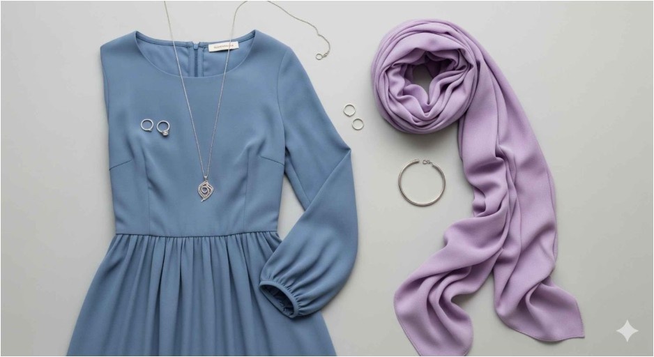
For outfits, imagine layering a dusty blue dress with a lavender scarf and a silver necklace. Each color slides seamlessly into the next, creating elegance without effort. For art, think of building a composition where a soft teal background meets a cool rose subject, accented by shadows of muted violet. The result feels natural, like colors melting into one another.
The palette also plays beautifully with textures and accessories. Smooth silks amplify its serenity, while matte fabrics or watercolor washes highlight its softness. Prints should stay subtle—florals, abstract waves, or delicate patterns—never loud geometrics or stark contrasts.
How-To: Build and Use Your Cool Summer Palette
Here’s how I teach my students to make the most of these hues:
- Start with base shades – Think powder blue, lavender, or rose pink as your anchors.
- Layer with depth – Add deeper tones like navy, plum, or teal to ground your palette.
- Use neutrals wisely – Tinted greys or soft silvers keep everything cohesive without dullness.
- Blend, don’t clash – Pair neighboring hues for harmony. A cool blue beside a blue-green reads elegant; a blue beside orange reads chaotic.
If you’re painting, experiment with glazes to achieve that blended look. If you’re dressing, let accessories reflect the mood—silver jewelry, grey handbags, or a cool-toned lip color enhance the palette without breaking the flow.
Why Is the Cool Summer Palette So Easy to Live With?
Beyond beauty, Cool Summer is practical. Because everything blends, you can build a wardrobe (or an artist’s toolkit) where nearly every piece works with every other. That means fewer expensive mistakes, fewer “nothing to wear” mornings, and a collection that always feels polished.
This palette also resists fads. While neon or earthy tones cycle in and out of trend, cool summer hues are timeless. A lavender blouse or a steel-blue painting won’t feel dated five years from now—they’ll still feel calm, chic, and relevant.
Also Read: Dark Autumn Color Palette
Frequently Asked Questions
1. Can warm-toned people wear the cool summer color palette?
Not comfortably. The palette is designed for those with naturally cool undertones. On warm-toned individuals, these shades can look flat or draining. Stick to your seasonal palette for the most flattering results.
2. What jewelry works best with Cool Summer?
Silver, white gold, and platinum complement these hues beautifully. Rose gold can work if it’s the cool, pinkish kind—not the coppery warm version. Avoid yellow gold, which tends to fight with the cool undertones.
3. Are there “universal” colors in the Cool Summer palette?
Yes—shades like navy and teal often look good on nearly everyone. But for true impact, wear your best colors near your face or as the focal point in artwork.
4. How do I keep Cool Summer outfits from feeling boring?
Play with texture and layering. A monochromatic outfit in dusty blue comes alive when one layer is silk, another is knit, and the accessories add shimmer. In art, mix media—combine watercolor softness with bold ink outlines in analogous shades.
Ending With a Cool Splash of Wisdom
The cool summer color palette may not have fiery reds or sunny yellows, but that’s its power. It’s calm, collected, and utterly wearable. It doesn’t overwhelm—it balances. For me, learning to embrace these hues was like learning to breathe slower. It changed the pace of how I painted, dressed, and even approached design.
So next time you stand in front of your wardrobe, or your blank canvas, remember: your colors don’t have to shout to be unforgettable. Sometimes, the softest hues leave the loudest impression.