


I still remember the first time I realized certain colors made me look like I hadn’t slept in a week. Muted browns, dull grays—they drained me completely. But the day I discovered the bright spring color palette, everything changed.
Suddenly, coral tops lit up my skin, and turquoise earrings made my eyes sparkle. It felt like unlocking a secret color language that had been waiting for me all along.
If you’ve ever tried on something vibrant and felt instantly alive, this palette might be your match too. Let me walk you through the essentials of Bright Spring, so you can use it to bring out your natural brilliance.
What Makes the Bright Spring Color Palette Special?
Bright Spring stands apart because of its clarity. The colors are highly saturated, crisp, and full of life. They don’t carry any dusty or gray undertones. That means when you wear them, they echo your own vibrant energy instead of dulling it down.
Another key trait is warmth. Bright Spring leans toward the sunny side of the spectrum, with a golden undertone running through most shades. Still, it borrows a little sharpness from Winter, which gives the palette an edge. It feels playful and tropical, but never heavy.
The value range sits mostly in the mid-tones. There are light shades like ivory and apricot, and deeper shades like chocolate brown or charcoal. But the sweet spot is those bold mid-tones that strike the perfect balance.
Who Looks Best in the Bright Spring Color Palette?
Bright Springs often have features that look clear and sparkling. Eyes tend to be bright blue, green, or hazel. Hair can be golden blonde, strawberry blonde, or warm brown with highlights of gold. Skin usually carries peachy or golden undertones that come alive in warm, saturated shades.
The easiest way to test? Try on a muted olive shirt, then switch to a coral or turquoise top. If the second option lights up your face and the first one makes you fade, Bright Spring is likely your season.
How Bright Spring Compares to Similar Seasons
It helps to see where Bright Spring sits in the seasonal wheel:
| Palette | Key Traits | Main Difference |
| Bright Spring | Warm + Clear + High Contrast | Vibrant, tropical feel |
| True Spring | Warm + Fresh + Medium Saturation | Softer and lighter |
| Bright Winter | Cool + Clear + High Contrast | Sharper, icy undertones |
If pastels look too weak on you and jewel tones feel too cold, Bright Spring could be your sweet spot.
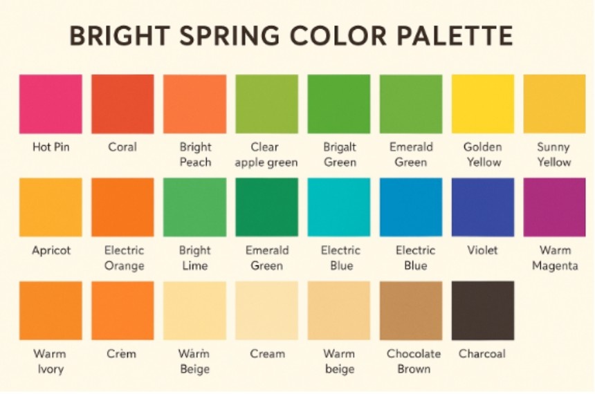
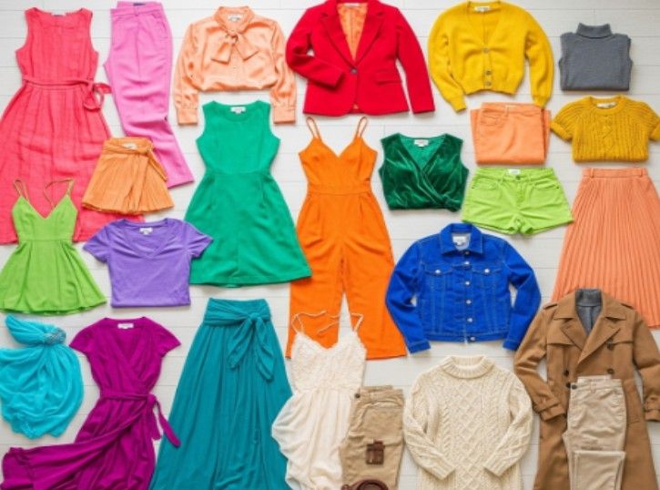
Which Colors Belong in the Bright Spring Color Palette?
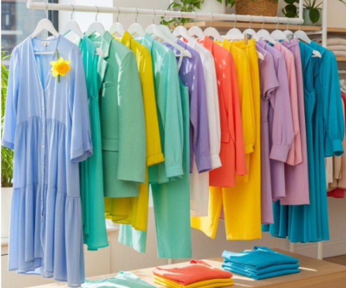
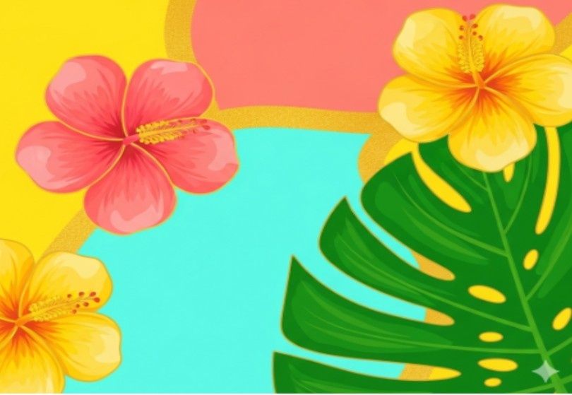
This palette is like a tropical garden. Every shade feels juicy and alive. Here are some highlights:
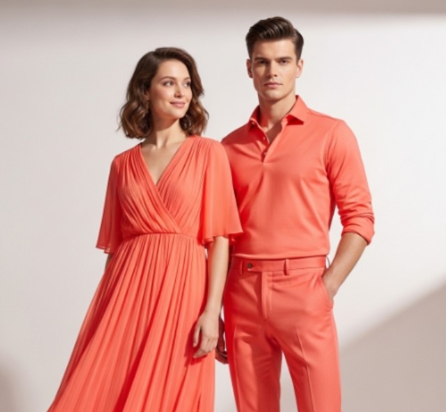
- Pinks and Reds: Coral, hot pink, peach, and tomato red.
- Yellows and Oranges: Daffodil, apricot, golden yellow, and electric orange.
- Greens: Lime, apple green, and emerald.
- Blues and Purples: Turquoise, teal, electric blue, violet, and magenta.
- Neutrals: Ivory, camel, cream, beige, chocolate brown, and charcoal.
Imagine pairing turquoise with coral, or sunny yellow with cobalt blue. These combinations capture the spirit of the palette—playful, bold, and full of contrast.
How Can You Style the Bright Spring Color Palette?
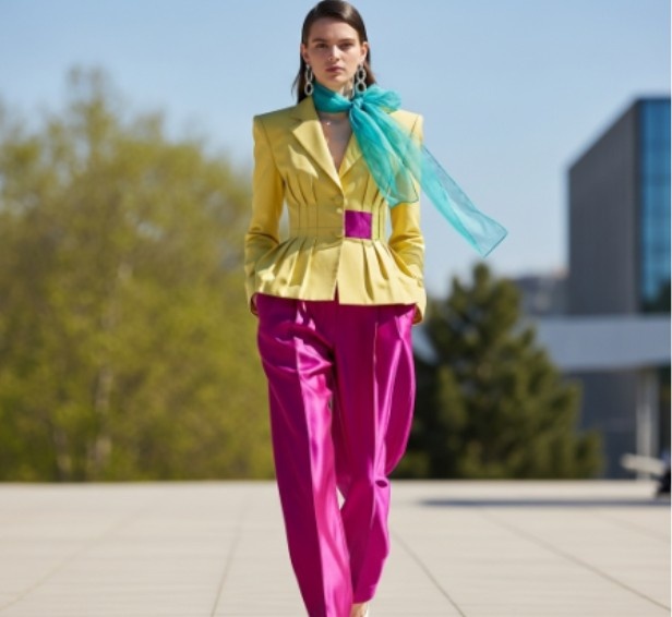
The fun part about being a Bright Spring is experimenting with high-contrast looks. Your features can handle boldness, so don’t shy away from it.
Start with neutrals like ivory trousers or a camel blazer. Then, layer in a statement piece like an emerald blouse or coral scarf. Accessories—bags, shoes, or jewelry—are perfect for adding a pop of electric color.
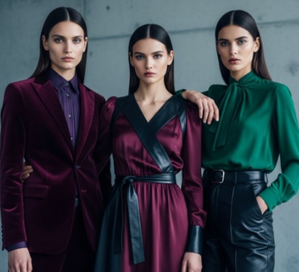
One rule of thumb: avoid muted shades. Dusty rose, olive green, or slate gray will flatten your features. If it looks like someone added a gray filter over a color, it probably isn’t for you.
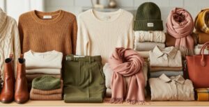
What Fabrics and Textures Work Best?
The finish of a fabric matters just as much as the shade. Bright Spring thrives on fabrics that reflect light and feel crisp. Think satin blouses, glossy silks, or structured cottons. Shiny finishes echo the brightness of the palette.
Matte or heavy textures, like muted tweeds or washed-out linens, don’t flatter as much. They soften the brilliance and create a mismatch. If you want to look fresh and awake, keep your fabrics lively.
How Do You Use the Bright Spring Color Palette in Makeup and Jewelry?
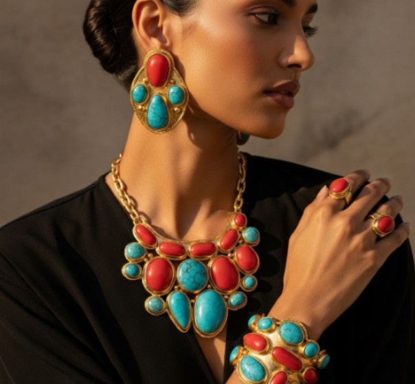
Makeup is an extension of the palette. Go for coral or peach blushes, bright lipsticks like watermelon pink or orange-red, and eyeshadows in golds or teals. A dewy finish on skin products also mirrors the glow of Bright Spring.
When it comes to jewelry, gold is your best friend. It warms up your natural coloring and works seamlessly with coral or turquoise stones. Rose gold can also work, especially when paired with peach tones.
How Do You Build a Wardrobe with the Bright Spring Color Palette?
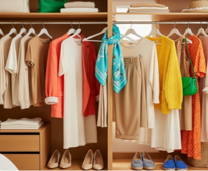
The easiest way is to start small. Invest in a few basics in your best neutrals: an ivory top, camel trousers, and a cream cardigan. These will anchor your outfits. Then add in accent pieces—maybe a coral jacket, a turquoise handbag, or a sunny yellow dress.
You don’t need to overhaul your entire wardrobe. Even swapping out muted scarves and accessories for brighter ones can make a big difference. Over time, you’ll naturally gravitate toward the shades that make you feel radiant.
Frequently Asked Questions
1. Can Bright Spring wear black?
Pure black is too harsh for most Bright Springs. It can overpower your natural brightness. A softer alternative like charcoal or deep chocolate brown works beautifully.
2. Is Bright Spring a rare season?
Yes, it’s less common than some other palettes. But that’s what makes it fun—your coloring has a unique blend of warmth and vibrancy that stands out.
3. Can I borrow from other palettes?
You can sometimes dip into True Spring for softer warm tones or Bright Winter for sharper cool shades. Just make sure the colors are still saturated and clear.
4. What lipstick shades work for Bright Spring?
Think coral, peach, watermelon pink, or tomato red. These colors brighten your face instantly and tie into the rest of your palette.
Color Me Confident: Your Bright Spring Superpower
The bright spring color palette isn’t about playing it safe. It’s about leaning into color that feels alive, joyful, and unapologetically bold. When you wear these shades, you don’t just look better—you look like yourself, turned all the way up.
My personal tip? Keep one Bright Spring accessory on hand at all times. For me, it’s a coral scarf. No matter what I’m wearing, tossing it on instantly lifts my mood and my look.
That’s the magic of color—it doesn’t just change how others see you, it changes how you feel about yourself.
So go ahead, embrace your palette, and let your colors shine.